Blue living rooms can feel either like a serene sanctuary or a cold, uninviting space. The difference lies in how you layer textures, balance contrasts, and choose complementary tones.
Getting these elements right transforms a room from flat and lifeless into a place where you actually want to spend your evenings curled up with a book or entertaining friends.
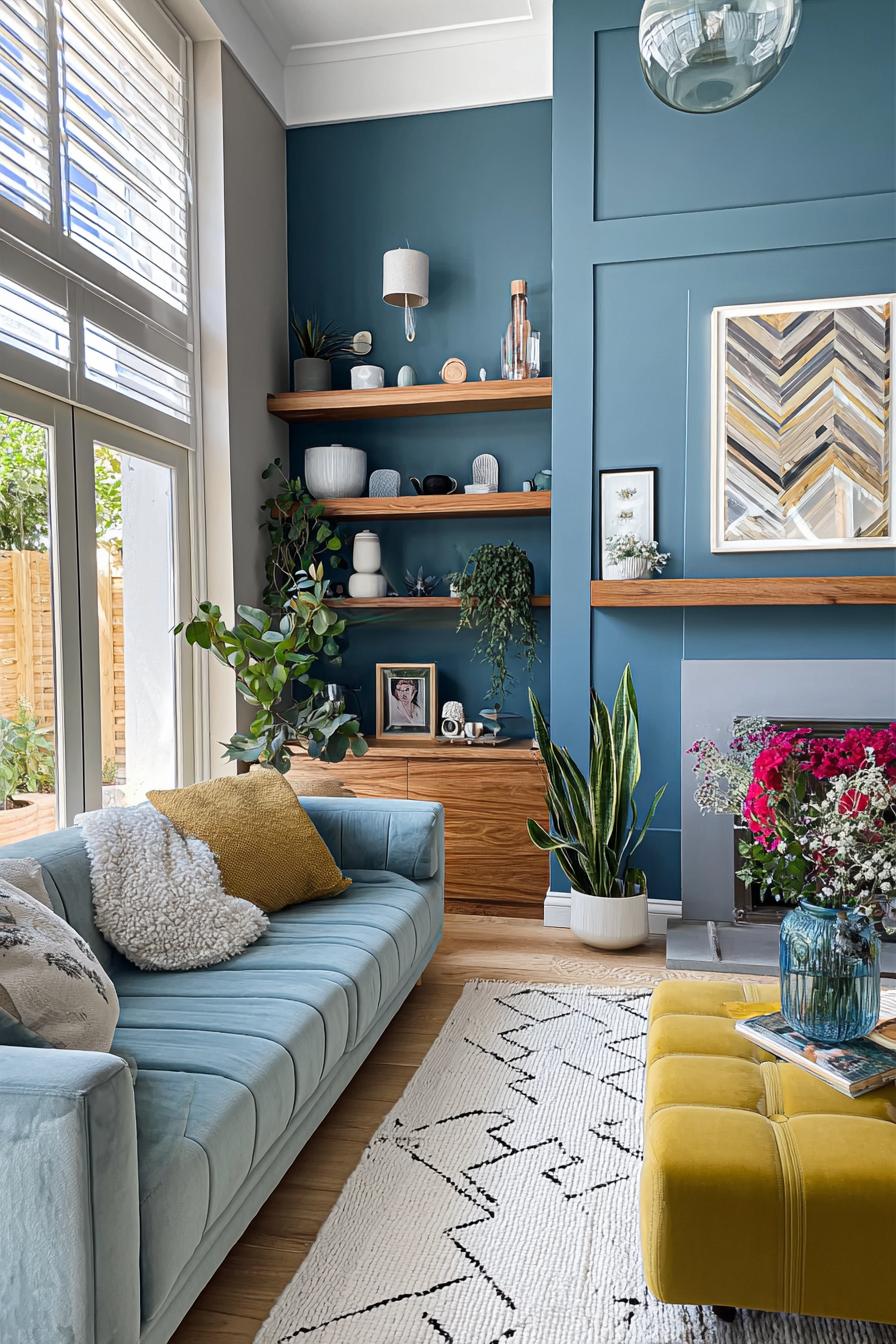
1. Balance Blue Walls and Brown Wood For Inviting Contrast
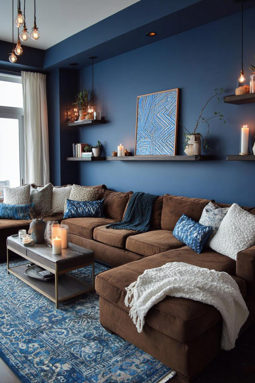
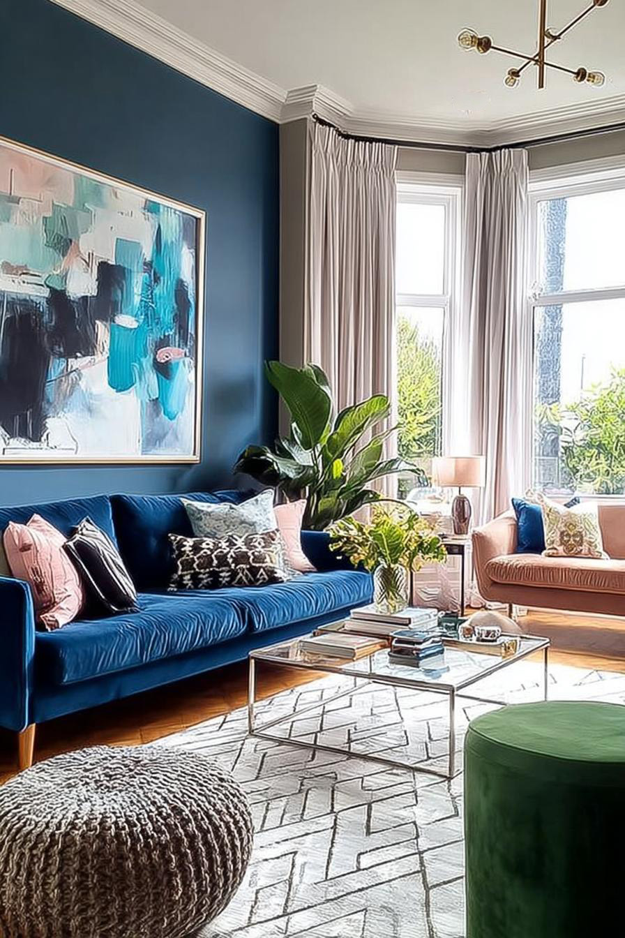
What if blue walls could look warm instead of icy? Pairing deep blue paint with rich brown wood furniture creates an unexpected harmony that feels both grounded and elegant. The natural grain of walnut or oak adds organic warmth that softens the coolness of blue.
Consider a navy accent wall behind a mid-century modern credenza in warm teak. The wood’s honey tones pull out subtle warmth hiding in the blue, while the blue makes the wood grain pop with new intensity. You could also try blue-gray walls with darker espresso pieces for a moodier, library-like atmosphere.
This combination prevents your living room from feeling either too cold or too heavy. The balance between cool and warm tones creates visual interest that holds your attention without overwhelming your senses, making the space feel lived-in rather than staged.
2. Display Chevron Wood Floors For Timeless Sophistication and Grey Warmth
Compare standard plank flooring to chevron patterns, and you’ll notice how the latter draws your eye across the room in dynamic zigzags. This classic European pattern adds movement underfoot while providing a neutral foundation that lets blue walls sing.
Grey-toned wood in chevron arrangement bridges the gap between traditional and contemporary design.
The pointed geometry creates subtle visual pathways that make smaller living rooms feel more expansive. When paired with powder blue or slate blue walls, grey chevron floors establish a sophisticated foundation that works whether your style leans minimalist or maximalist.
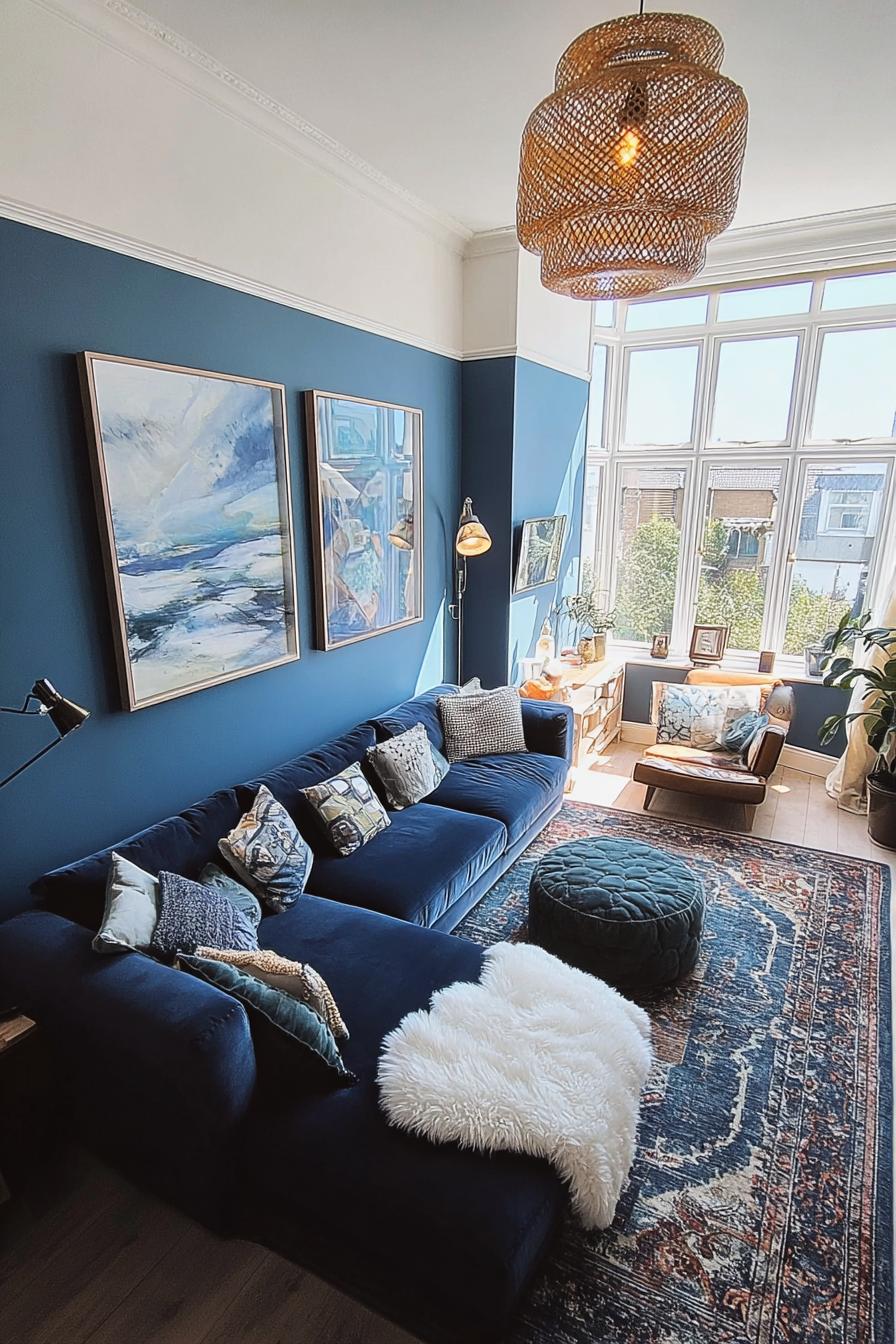
3. Layer a Textured White Rug For Soft Visual Contrast
Can you soften a blue room without diluting its impact? A plush white rug with visible texture – think shag, Moroccan boucheroute, or braided wool – acts as a cloud anchoring your seating area. The contrast between saturated wall color and pristine floor covering creates breathing room for your eyes.
Texture matters more than you might think here. A flat white rug can feel clinical, but one with dimension catches light differently throughout the day, adding subtle movement to your space. This works especially well when your blue walls skew darker, as the white reflects light back into the room.
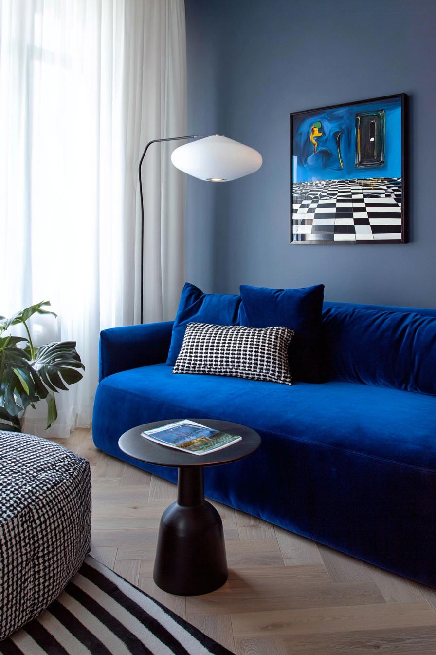
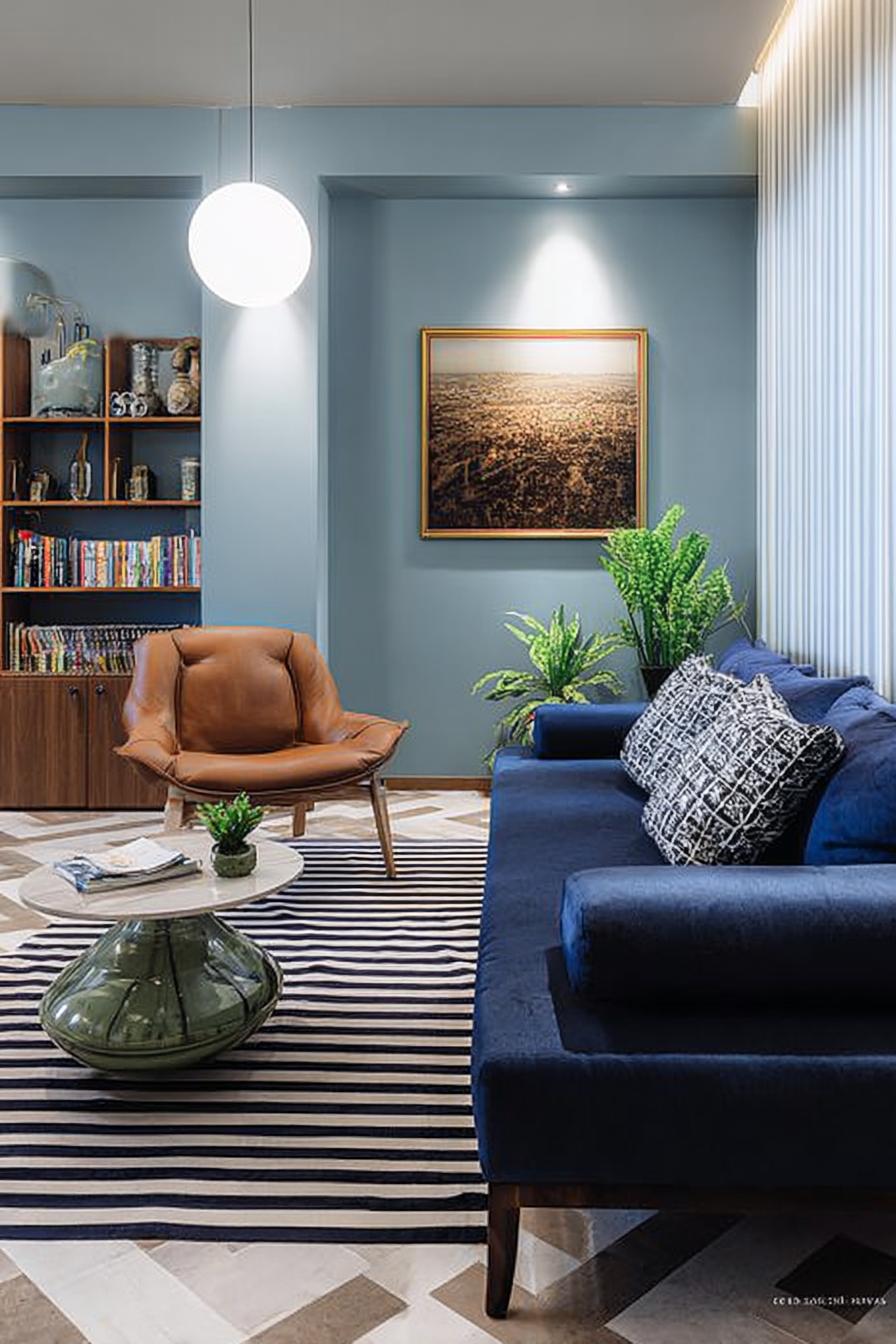
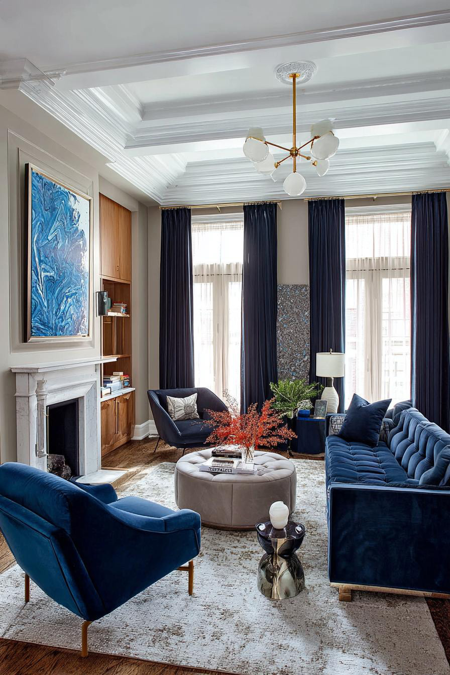
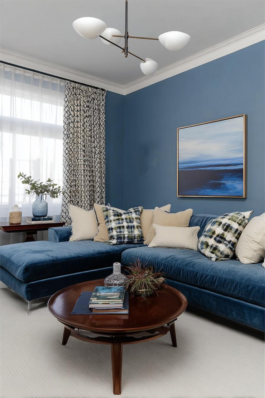
4. Highlight a Velvet Couch For Modern Luxe Appeal
Notice how light moves across velvet differently than flat fabrics? A velvet sofa in navy, sapphire, or even teal becomes a jewel-toned centerpiece that shifts appearance as you walk past. The pile catches and reflects light, creating depth that flat upholstery simply can’t match.
This fabric choice elevates your living room instantly, making even budget-friendly furniture frames feel expensive. Velvet also adds acoustic softness to the room – an often-overlooked benefit that makes conversations feel more intimate. Plus, modern performance velvets resist staining far better than their vintage counterparts.
Just don’t pair velvet with too many other competing textures. Let it be the star, supported by simpler linen or cotton textiles, or the room risks feeling like a fabric store exploded.
5. Showcase Floating Shelves to Display Eye Catching Living Room Decor
You’d be surprised how empty walls can make even beautiful blue feel flat. Floating shelves in light wood or white lacquer break up expanses of color while creating opportunities to display objects that reflect your personality. The horizontal lines also subtly widen the perceived room dimensions.
Style them with a mix of books, small plants, ceramic pieces, and framed photos in varying heights. The key is leaving some breathing room – overcrowded shelves lose their impact and start looking cluttered rather than curated.
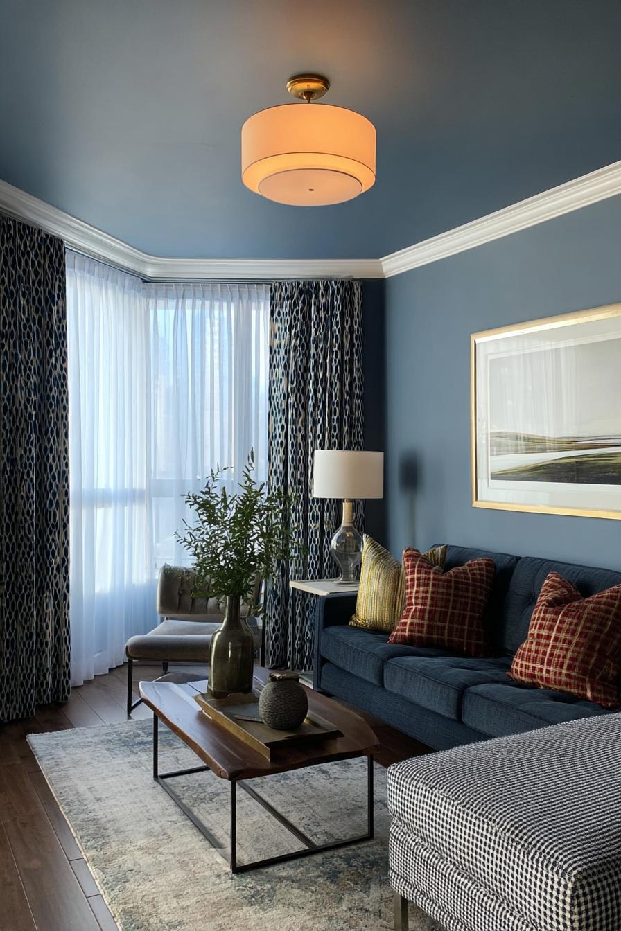
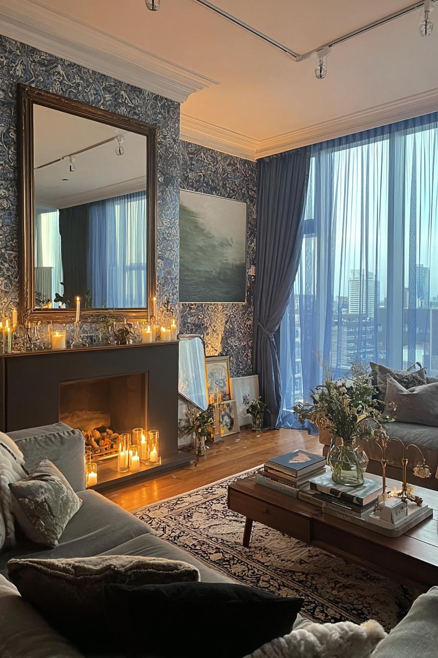
6. Contrast Sheer White Curtains Against Deep Blue Walls
Three elements make this pairing work: light, movement, and frame. Sheer white curtains soften natural light pouring through windows, creating a diffused glow that prevents dark blue walls from feeling cave-like. They flutter with air movement, adding life to static walls.
Floor-to-ceiling installation makes your ceilings appear taller, while the stark white-against-blue contrast emphasizes architectural features. During evening hours, when you draw heavier drapes or blinds underneath, the sheers remain as a soft layer that maintains the color contrast even with window treatments closed.
7. Group Coffee Table Books For Effortless Living Room Accents
Most people scatter decorative books randomly, missing an opportunity. Stacking oversized art, architecture, or photography books on your coffee table creates instant visual weight and signals refined taste. The spines and covers add color accents that you can coordinate with your blue scheme.
Choose books with covers in complementary tones – burnt orange, cream, sage green, or gold – to create intentional color moments. A stack of three to five books topped with a small sculptural object or candle becomes an effortless vignette that looks considered without trying too hard.
What books are sitting on your shelves right now that could work harder for your room’s aesthetic?
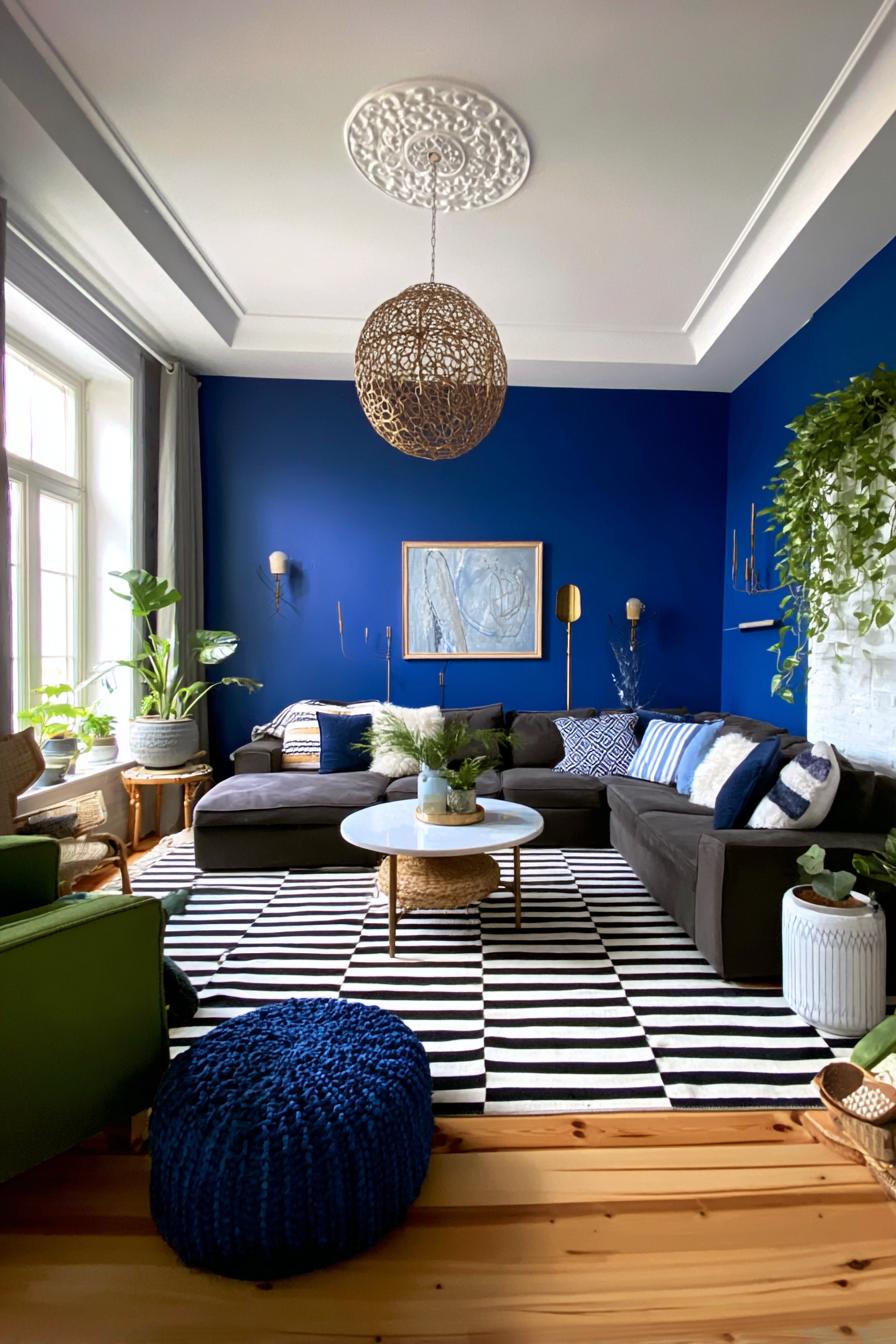
8. Add Woven Light Fixtures For Casual Modern Texture
If you want to prevent blue from feeling too formal or buttoned-up, natural fiber light fixtures provide the perfect counterbalance. Rattan, seagrass, or jute pendants introduce organic texture overhead, where it’s often overlooked. The woven material casts beautiful dappled shadows that add another layer of visual interest.
These fixtures work especially well in coastal or bohemian-leaning spaces, but they’ve evolved beyond beach house clichés. Modern designs with clean geometric shapes bring structure to the natural material, making them suitable even for contemporary blue living rooms with sleek furniture.
The warmth of natural fibers also tempers cooler blue tones without competing for attention. Your eye travels upward, discovers something unexpected, and the room instantly feels more complete.
9. Incorporate Tall Green Plants to Freshen Your Living Space
Living greenery breathes life into blue rooms literally and figuratively. A fiddle leaf fig, bird of paradise, or tall snake plant in the corner adds vertical drama while introducing organic shapes that contrast beautifully with architectural lines and upholstered curves.
The green-and-blue combination taps into our innate response to nature – think ocean meeting forest, or sky above meadow. This biophilic design principle explains why these colors paired together feel so instinctively right. You’ll notice the room feels fresher, more oxygenated, more alive.
Position plants where they’ll catch natural light while also balancing your furniture arrangement. A tall plant can fill an awkward corner, frame a seating area, or provide privacy screening without installing permanent architecture. Scale matters here – choose plants that relate proportionally to your ceiling height and furniture size.
The trend toward indoor greenery shows no signs of slowing. As we spend more time indoors, bringing nature inside becomes less about decoration and more about wellness – a shift that makes plants essential rather than optional elements.
10. Frame Monochrome Artwork For a Sophisticated Blueprint Accent

You might think colorful art is necessary to warm up blue walls, but black-and-white photography or line drawings create striking focal points that feel collected and intentional. The high contrast works beautifully against mid-tone to dark blues, while the absence of competing colors lets your wall color remain the star.
Monochrome art brings a gallery-like quality to your living room. It suggests restraint and confidence – you don’t need busy patterns or bright colors to make a statement. This approach works whether you prefer abstract compositions, architectural photography, or figurative sketches.
Don’t overcrowd your walls trying to fill every inch. Sparse, well-chosen pieces have far more impact than a cluttered salon wall, and they avoid making your carefully chosen blue feel like mere background.
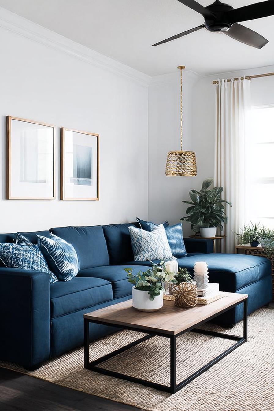
11. Layer Soft Textiles For an Inviting Blue Living Room Couch
Think of your sofa as a bed you’re making – each layer adds comfort and visual interest. Start with the upholstery, add a throw blanket in complementary texture draped casually over one arm, then arrange pillows in varying sizes and fabrics. This creates depth that a bare sofa can’t achieve.
The layering softens the sometimes formal feeling blue can project. A chunky knit throw in cream or oatmeal adds cozy texture, while velvet or silk pillows introduce subtle sheen. Mixing matte and reflective textiles catches light differently, making your sofa more visually dynamic throughout the day.
The effect transforms your couch from furniture into an invitation. Are you creating a space that beckons guests to sit and stay, or just a pretty backdrop for photos?
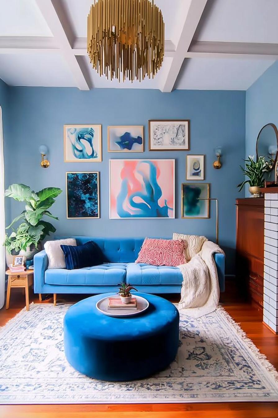
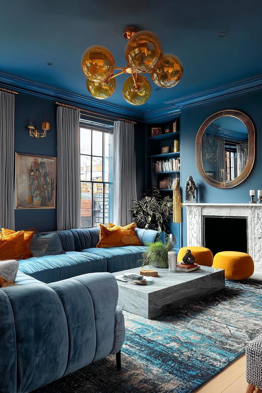
12. Install a Gold Modern Chandelier For Dramatic Ceiling Interest
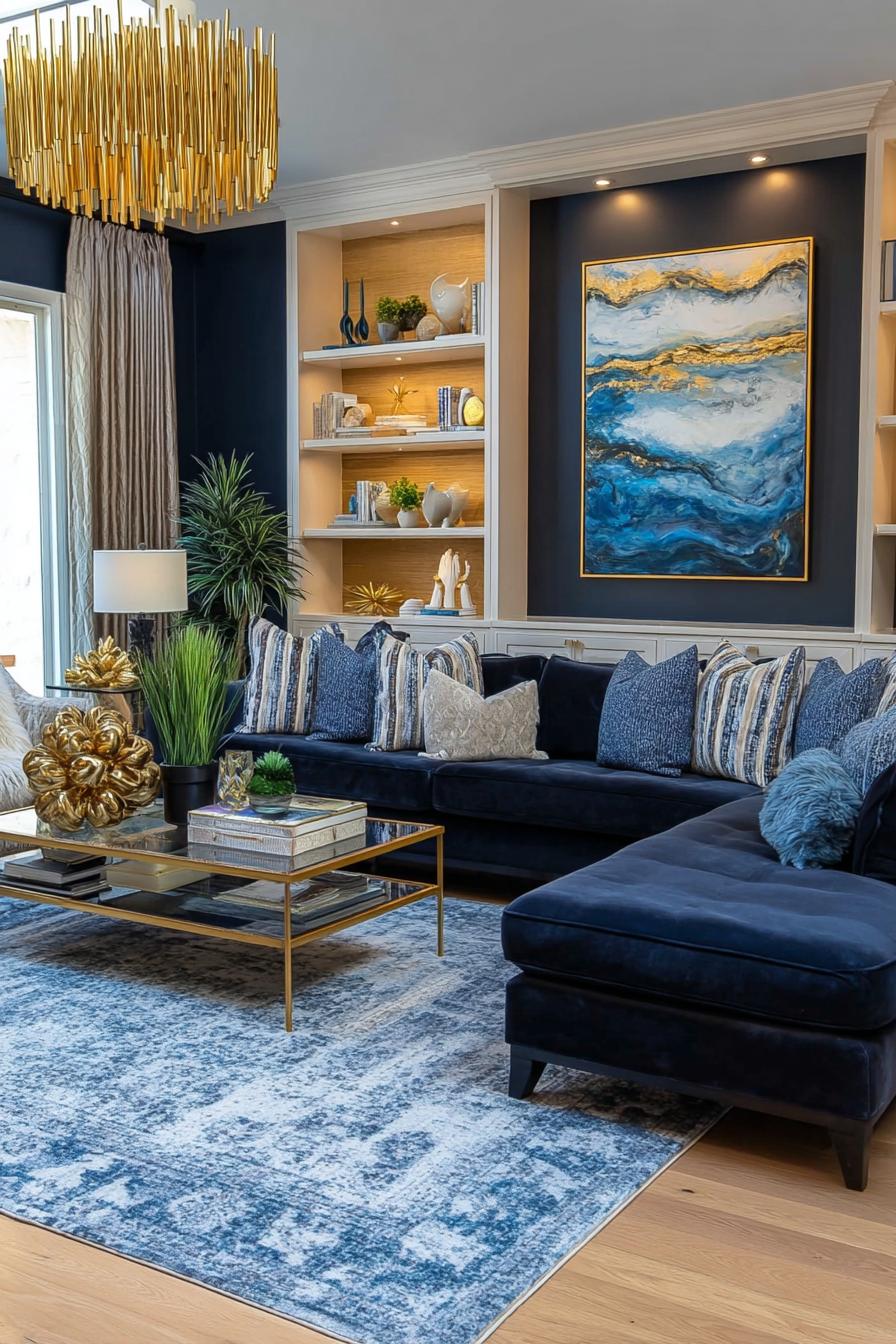
Let’s be honest – ceiling lights are usually afterthoughts, but they shouldn’t be. A statement chandelier in brushed gold or brass finishes adds jewelry to your room, drawing eyes upward and making your space feel more dimensionally designed. Against blue walls, warm metallic tones create luxurious contrast.
Modern geometric chandeliers avoid the fussy, traditional associations that turn some people off from statement lighting. Look for linear designs, abstract sculptural shapes, or minimalist globe arrangements. The scale should feel generous – too-small fixtures disappear and look like mistakes rather than choices.
This element also solves the common problem of blue rooms feeling dark. Metallic fixtures amplify both natural and artificial light, bouncing it around the room in ways that simple recessed lighting can’t match.
Expect to see more homeowners treating lighting as sculpture rather than utility. As open-concept living blurs room boundaries, chandeliers help define zones while adding personality overhead.
13. Mix Patterned Throw Pillows For Dynamic Living Room Ideas
Patterned pillows are having a moment, moving beyond matching sets to curated collections that tell a story. Mix geometric prints with organic florals, pair stripes with ikat, or combine different scale patterns in a controlled color palette. This approach adds energy to blue seating without overwhelming the space.
The key to successful pillow mixing is controlling your color story. Pull accent colors from your blue – if it has gray undertones, incorporate gray-and-white patterns; if it leans teal, bring in touches of green and gold. Vary the scale from large bold prints to tiny detailed patterns so they don’t compete.
Texture variation matters as much as pattern. Combine smooth cotton, nubby linen, sleek velvet, and perhaps one embroidered or embellished pillow for tactile interest. Odd numbers typically look more natural than even groupings – five or seven pillows feels collected rather than matchy-matchy.
One practical tip: choose one or two neutral pillows that can stay year-round, then swap seasonal accent pillows to refresh your room without major overhauls.
14. Showcase a Glass Coffee Table For Sleek Modern Functionality
Remember how we talked about chevron floors earlier? A glass coffee table lets those beautiful floors remain visible, creating visual continuity that makes your living room feel more spacious. The transparency prevents the room’s center from feeling heavy or blocked.
Picture a round glass-top table with brass or black metal legs in front of a blue velvet sofa – the combination feels airy yet substantial. Glass works especially well in smaller living rooms where solid wood tables would visually consume too much real estate. It also showcases beautiful rugs underneath without hiding them.
Style the glass surface minimally to maintain the open feeling. A small stack of books, one sculptural object, and perhaps a low bowl or tray for corralling remotes keeps the surface functional without negating its transparency.
Start noticing how glass furniture changes your perception of space, and you’ll find yourself rethinking other heavy pieces in your home.
15. Arrange Metallic Decor Accessories For Reflective Living Room Accents
Blue rooms can absorb light, making them feel darker than intended. Metallic accessories – brass candlesticks, silver photo frames, copper bowls, or gold-rimmed trays – scatter light around the room like tiny mirrors. This reflective quality brightens without adding more lamps.
The effect is subtle but cumulative. One metallic piece barely registers, but five or six distributed throughout the space creates a gentle shimmer that lifts the room. Mix metals freely; the old rules about matching are outdated, and variety looks more collected than coordinated sets.
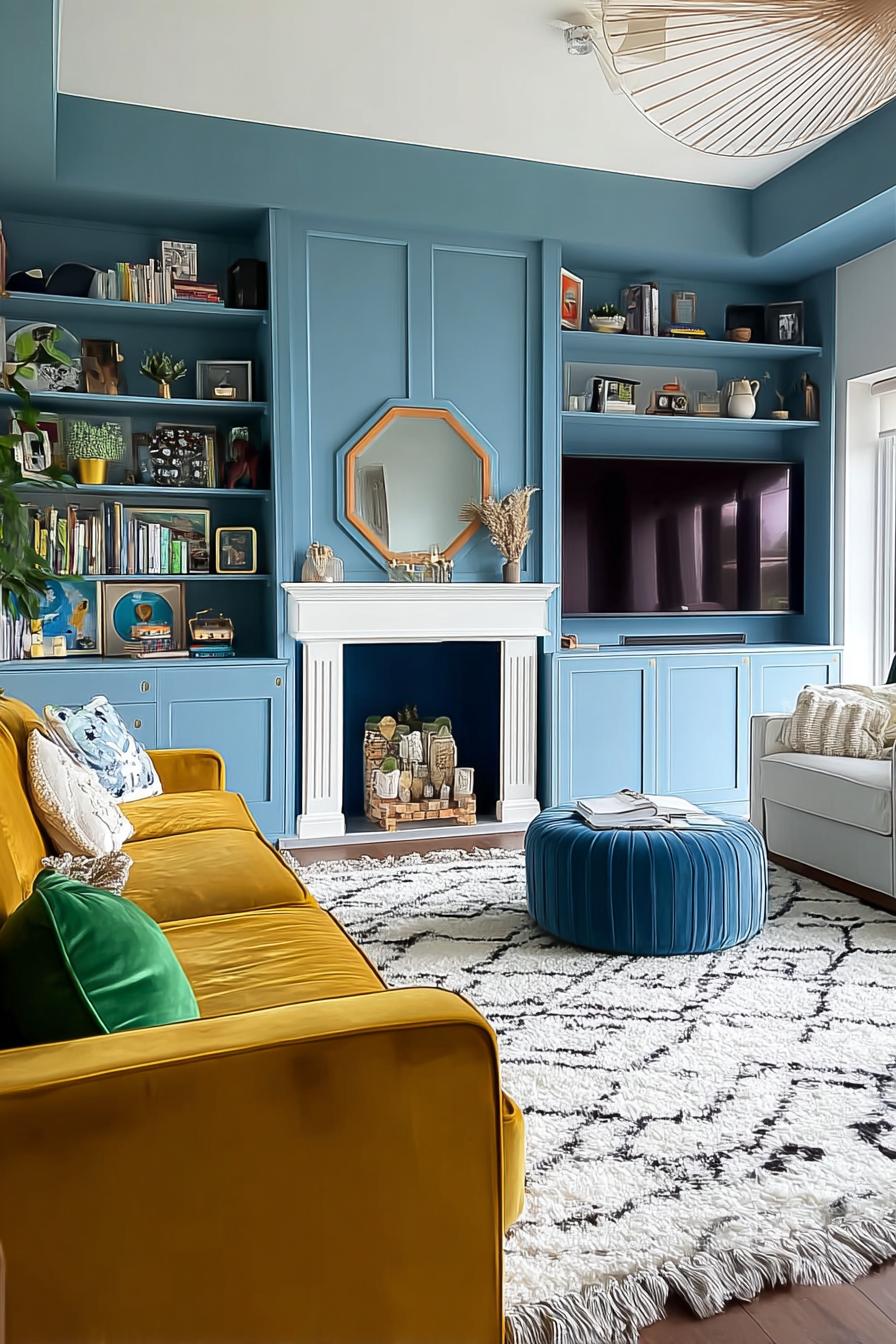
16. Add Mustard Accent Pillows For a Bold Contrast
While soft neutrals complement blue beautifully, mustard yellow creates electric contrast that energizes the entire room. This bold pairing taps into complementary color theory – blue and yellow-orange sit opposite on the color wheel, making each appear more vibrant.
Start conservatively with two mustard pillows if you’re nervous about the commitment. The beauty of this combination is that it reads as sophisticated rather than primary-school bright, especially when you choose deeper, golden yellows rather than lemon shades. The warmth in mustard counteracts any coldness in your blue walls, creating balance.
17. Position Layered Coffee Tables For Flexible Entertaining Options
Use nesting tables or overlapping surfaces to create flexible coffee table arrangements. Two or three tables in graduated sizes give you options – push them together for a unified surface during parties, or separate them to create distinct zones for different seating areas.
This approach works particularly well in living rooms where you entertain frequently. Smaller tables can migrate to wherever guests are sitting, eliminating the awkward lean-forward-and-reach that happens with single fixed tables. Look for mixed materials – perhaps metal frames with wood or marble tops – to add textural variety.
18. Style a Cozy Reading Nook By the Fireplace

Here’s something interesting: fireplaces and reading chairs have been paired since humans discovered both, yet we often overlook this natural combination. If your blue living room includes a fireplace, claim the adjacent space for a dedicated reading spot with a comfortable chair, good lighting, and a small side table.
The blue backdrop makes the nook feel cocooned and separate from the main seating area – a room within a room. Add a floor lamp with adjustable light for evening reading, and a small basket for storing books or magazines.
The fireplace provides ambient warmth and the hypnotic visual interest of flames, making this spot irresistible during colder months.
Layer in a throw blanket and small pillow for extra comfort. The nook becomes your retreat space, separate from where you entertain or watch television. Even if you rarely use it, the visual suggestion of a reading spot makes your living room feel more thoughtful and personalized.
19. Feature a Gilt Mirror For Classic Elegance and Decor Charm
Mirrors are secret weapons, but gold-framed versions do double duty. The mirror itself bounces light and expands perceived space – standard mirror benefits. But an ornate gilt frame against blue walls creates a moment of Old World elegance that elevates the entire room beyond standard contemporary design.
This combination works whether your style skews traditional or eclectic. In fact, the contrast between classic mirror frames and modern furniture creates the kind of high-low mix that designers love. Position the mirror opposite a window to maximize light reflection, or above a console table to create a functional entry moment.
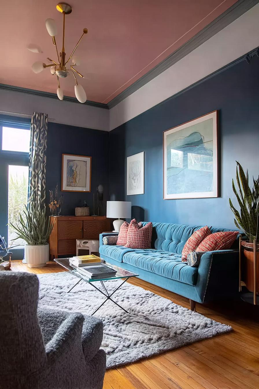
20. Paint the Ceiling Blue For Dramatic Living Room Impact
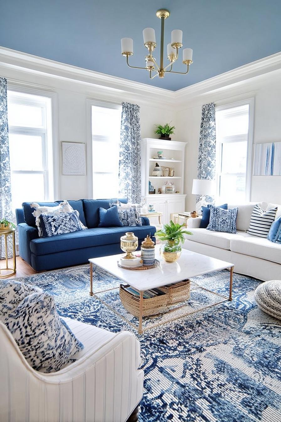
Most people stop at walls, but extending blue onto your ceiling creates an enveloping effect that’s surprisingly cozy rather than claustrophobic. This bold choice works especially well with lighter blue shades – think powder blue or robin’s egg – which read as sky-like and expansive.
The continuous color eliminates the visual stop that white ceilings create, making walls appear taller. Your eye doesn’t know where to stop, which paradoxically makes the room feel larger. It also emphasizes architectural details like crown molding or coffered ceilings by rendering them in relief.
This approach suits rooms with good natural light particularly well. In darker spaces, consider painting just a tray ceiling or single architectural element rather than the entire ceiling plane.
Proceed with samples first. Ceiling color reads differently than vertical surfaces, and what looks perfect on a wall might feel too intense overhead. Test your shade on foam board attached to the ceiling for several days before committing.
21. Install a Gallery Wall For Personalized Living Room Decor
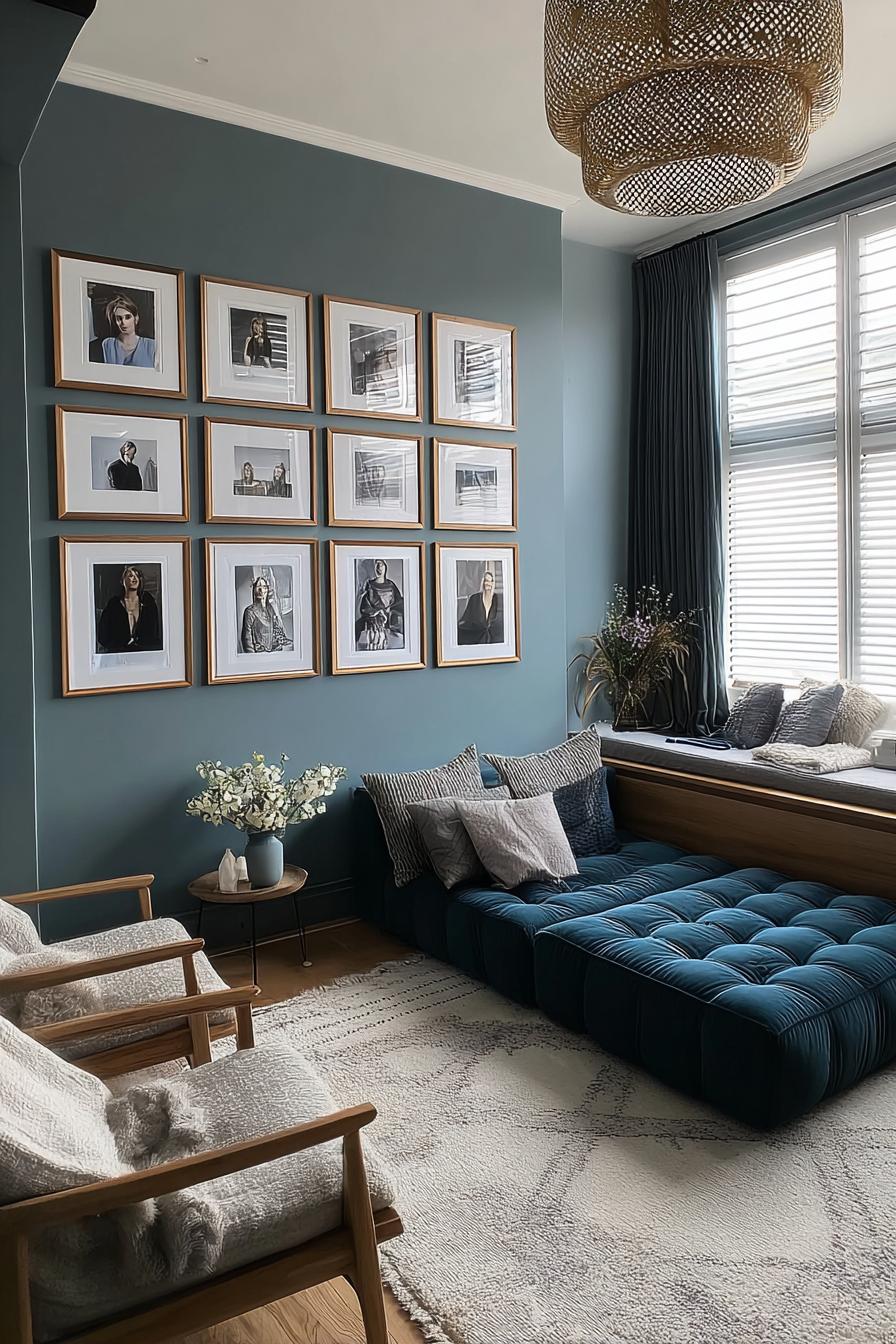
How do you make a blue living room feel distinctly yours rather than catalog-perfect? A gallery wall transforms blank space into autobiography. Mix family photos with art prints, vintage finds with modern pieces, creating a collection that no one else could replicate.
The blue backdrop acts as a unifying element, allowing disparate frame styles and image subjects to coexist harmoniously. You might worry that mixing too many elements creates chaos, but the wall color provides enough visual consistency to hold everything together.
Start with anchor pieces – usually the largest frames – then fill in around them with smaller works.
Plan your layout on the floor first, arranging and rearranging until the composition feels balanced. You’re looking for visual weight distribution rather than symmetry – heavier, darker pieces balanced by lighter, more delicate ones. Maintain consistent spacing between frames (typically 2-3 inches) for cohesion.
The beauty of gallery walls is their evolution. You can add new pieces over time, swap out images seasonally, or rearrange entirely when you need a refresh. This flexibility makes them more personal and sustainable than single large artworks that become invisible through familiarity.
22. Organize Built in Blue Shelving For Striking Living Room Storage

You have a unique opportunity if you’re renovating or building custom elements. Painting built-in shelving the same blue as your walls creates a striking monochromatic moment where the storage itself becomes architectural feature rather than furniture. The continuous color emphasizes the built-in nature, making it feel like original architecture.
This works especially well in traditional homes where built-ins flank fireplaces or frame windows. The blue makes newer construction look like it’s always been there, while objects displayed on the shelves pop against the colored backing.
Books, white ceramics, plants, and decorative objects gain visual impact when presented against colored backgrounds instead of standard white.
Consider painting just the interior backs of shelves if full blue feels too intense, leaving the frames and shelves in white or wood. This creates a shadow-box effect that still highlights your displays while providing some visual relief.
Style thoughtfully rather than cramming every inch. Group similar objects, vary heights, and leave some empty space so your eye can rest. Does the shelving showcase your life and interests, or does it just hold stuff?
23. Accent Your Side Table with Modern Sculptural Vases
What if your side tables could do more than hold lamps? Sculptural vases – even empty ones – function as small artworks that add vertical interest and personality to surfaces. Look for interesting organic shapes, unusual proportions, or architectural angles that catch your eye.
Against blue walls, white or cream ceramic vases create clean contrast, while brass or colored glass adds warmth. The vase itself matters more than what’s in it; in fact, empty statement vases often look more intentional than those struggling to hold last week’s drooping flowers.
24. Choose Patterned Drapes to Add Subtle Modern Drama
Move beyond solid curtains and discover how pattern adds dimension. Select drapes with geometric prints, subtle botanicals, or abstract designs that incorporate your wall blue plus one or two accent colors. This approach softens the walls while maintaining color cohesion.
Imagine blue walls with curtains in a blue-and-white ikat pattern – the repetition of blue reads as intentional rather than matchy, while the pattern adds visual texture. Or consider a large-scale modern floral in navy and gold that picks up metallic accents elsewhere in the room.
Floor-length drapes with pattern draw the eye vertically, emphasizing ceiling height while the design itself entertains the eye. The pattern creates visual interest in an area that’s often overlooked – windows dressed in solid fabric fade into backgrounds, but patterned versions become room features.
Choose carefully and these drapes bridge decor styles with ease.
25. Display an Oversized Ottoman For Relaxed Seating Ideas
Traditional coffee tables feel too formal for many modern lifestyles, but what replaces them? An oversized upholstered ottoman solves multiple problems: it provides soft surface space for trays and books, offers extra seating when needed, and creates a casualness that hard-surface tables can’t match.
In blue living rooms, the ottoman choice carries particular weight. A leather ottoman in cognac or caramel tones introduces warmth and texture, while blue velvet creates luxurious monochrome. Patterned upholstery in complementary colors can pull together your entire scheme, acting as a bridge between wall color and accent tones.
The practical benefits extend beyond aesthetics. Ottomans with hidden storage solve the perpetual problem of where to stash extra blankets, games, or seasonal items. And unlike glass or wood tables, they’re soft – parents with young children particularly appreciate furniture without sharp corners.
Size matters significantly here. Too-small ottomans look like afterthoughts, while generous proportions make a statement and actually function for multiple uses. Measure your space and aim for an ottoman roughly two-thirds the length of your sofa.
Add a large tray on top when you need a stable surface for drinks or decor, then remove it when you want the full soft surface.
26. Showcase Blue Drapery to Enhance Serene Living Room Decor
Sometimes the answer is more blue, not less. Floor-to-ceiling blue drapes in a slightly different shade than your walls create subtle tonal variation that adds depth without introducing new colors. This monochromatic approach feels serene and sophisticated.
Choose drapes one or two shades lighter or darker than your walls for gentle contrast – matching too exactly can feel flat. The fabric texture also matters; linen drapes catch light differently than velvet or silk, adding visual interest through material rather than color.
The vertical fall of fabric adds softness to architectural lines while the blue-on-blue scheme creates an enveloping, cohesive atmosphere.
Conclusion
Your blue living room holds potential waiting to be unlocked through thoughtful layering, contrast, and personal touches. Start with one or two ideas that resonate most strongly with your space and style, then build from there. The beauty of these approaches is their flexibility – mix, adapt, and make them yours.
Your living room should tell your story in your favorite shade of blue, so begin today by choosing the first element that will transform your space from ordinary to extraordinary.