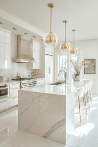
Do you ever walk into your kitchen and feel like something’s missing – a spark, perhaps, that transforms cooking from routine to joy? Most kitchens default to safe neutrals, but injecting color can completely shift the energy of your home’s heart.
Adding vibrant hues doesn’t mean painting everything rainbow-bright. Smart color choices, from soft pastels to bold jewel tones, can make your kitchen feel larger, warmer, or simply more *you*.
1. Showcase Playful Pastel Cabinets For a Bright Apartment
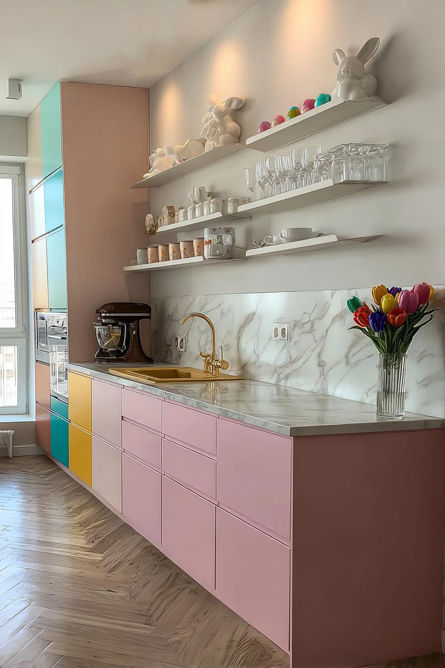
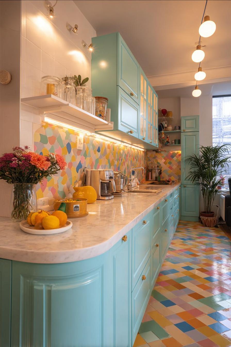
Building on the power of color psychology, pastel cabinets offer a softer approach than their bold counterparts. These gentle hues – think mint green, blush pink, or powder blue – create an airy atmosphere that feels both modern and timeless.
In smaller apartments, pastels work magic. They reflect light beautifully, making cramped quarters feel more spacious. Picture walking into a kitchen with sage green lower cabinets paired with crisp white uppers – suddenly, that galley layout doesn’t feel quite so narrow anymore.
The beauty lies in how pastels play well with others. You can pair them with brass hardware for warmth, or sleek chrome for a contemporary edge. Natural wood accents bring earthiness, while marble countertops add sophistication.
Here’s the catch though: pastels show dirt and wear more readily than darker shades. Fingerprints on blush pink doors? They’ll show. Splatter marks on that dreamy mint finish? You’ll spot them immediately. Regular cleaning becomes non-negotiable, but for many, the cheerful morning mood these colors create makes the extra maintenance worthwhile.
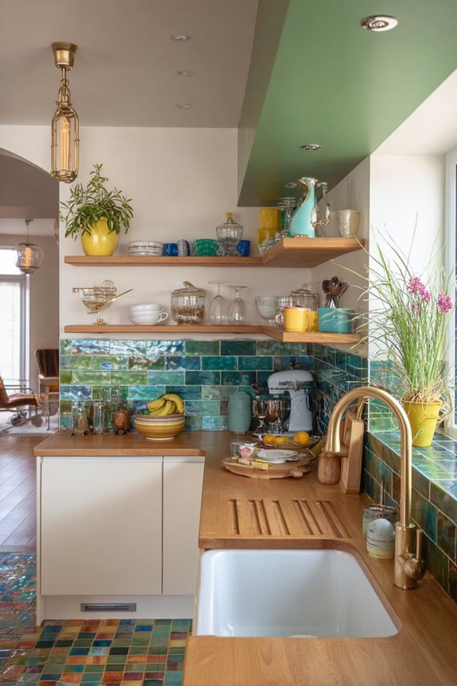
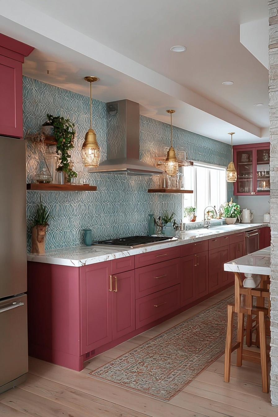
2. Arrange Fresh Greenery on Shelves For a Lively Backdrop
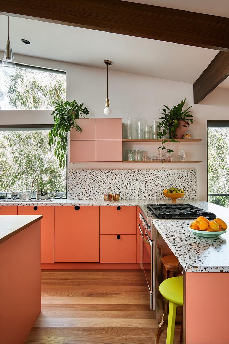
Place potted herbs along your open shelving – now. Start with basil, rosemary, and mint in mismatched terracotta pots for instant character.
Living plants do double duty in kitchens. They purify air while providing fresh ingredients at arm’s reach. That sprig of thyme you need for tonight’s roast chicken? It’s right there, growing happily beside your favorite mugs. The visual payoff beats any static decoration – plants shift and grow, creating an ever-changing display.
Consider mixing heights and textures for maximum impact. Trailing pothos cascades elegantly from high shelves, while compact succulents cluster near eye level. Add a fiddle leaf fig in the corner if you have space – its broad leaves create architectural interest. Between the plants, tuck in colorful cookbooks or ceramic pieces.
The green becomes a unifying thread that ties disparate elements together, making even the most eclectic collection look intentional. An open kitchen design provides the perfect showcase for this living décor.
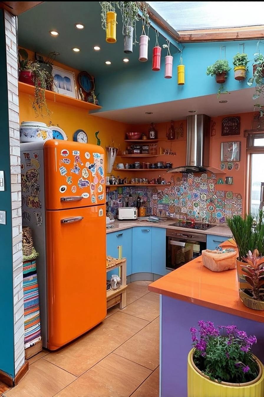
3. Let a Nostalgic Pastel Fridge Be the Kitchen Focal Point
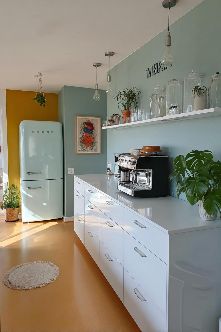
First, understand that a statement fridge changes everything. Second, know that pastel models – especially those retro-inspired beauties – command attention like no stainless steel box ever could. Third, prepare for compliments.
These vintage-style refrigerators emerged from our collective nostalgia for simpler times. Brands like SMEG capitalized on this longing, creating modern appliances wrapped in 1950s aesthetics.
The rounded corners, chrome handles, and candy colors transport you to an era of milkshakes and sock hops – even if you’re just grabbing oat milk for your morning coffee.
A robin’s egg blue fridge transforms the entire kitchen dynamic – it becomes the star while everything else plays supporting roles.
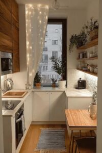
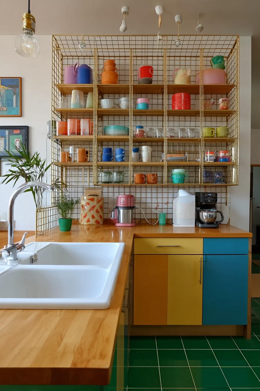
4. Install a Wood Shelf to Display Colorful Accessories

A single floating walnut shelf can revolutionize your kitchen’s color story. Mount it at eye level where natural light hits, creating the perfect stage for your brightest pieces.
This approach lets you experiment with color without commitment. Arrange turquoise mixing bowls next to coral ceramics, or line up vintage glass bottles in jewel tones. The wood grain grounds these pops of color, preventing visual chaos. As seasons change, so can your display – swap summer’s bright yellows for autumn’s burnt oranges.
The shelf becomes a rotating gallery where your kitchen accessories double as art.
A white kitchen provides an ideal backdrop for these colorful pieces.
What colors speak to you when you imagine your dream kitchen display?
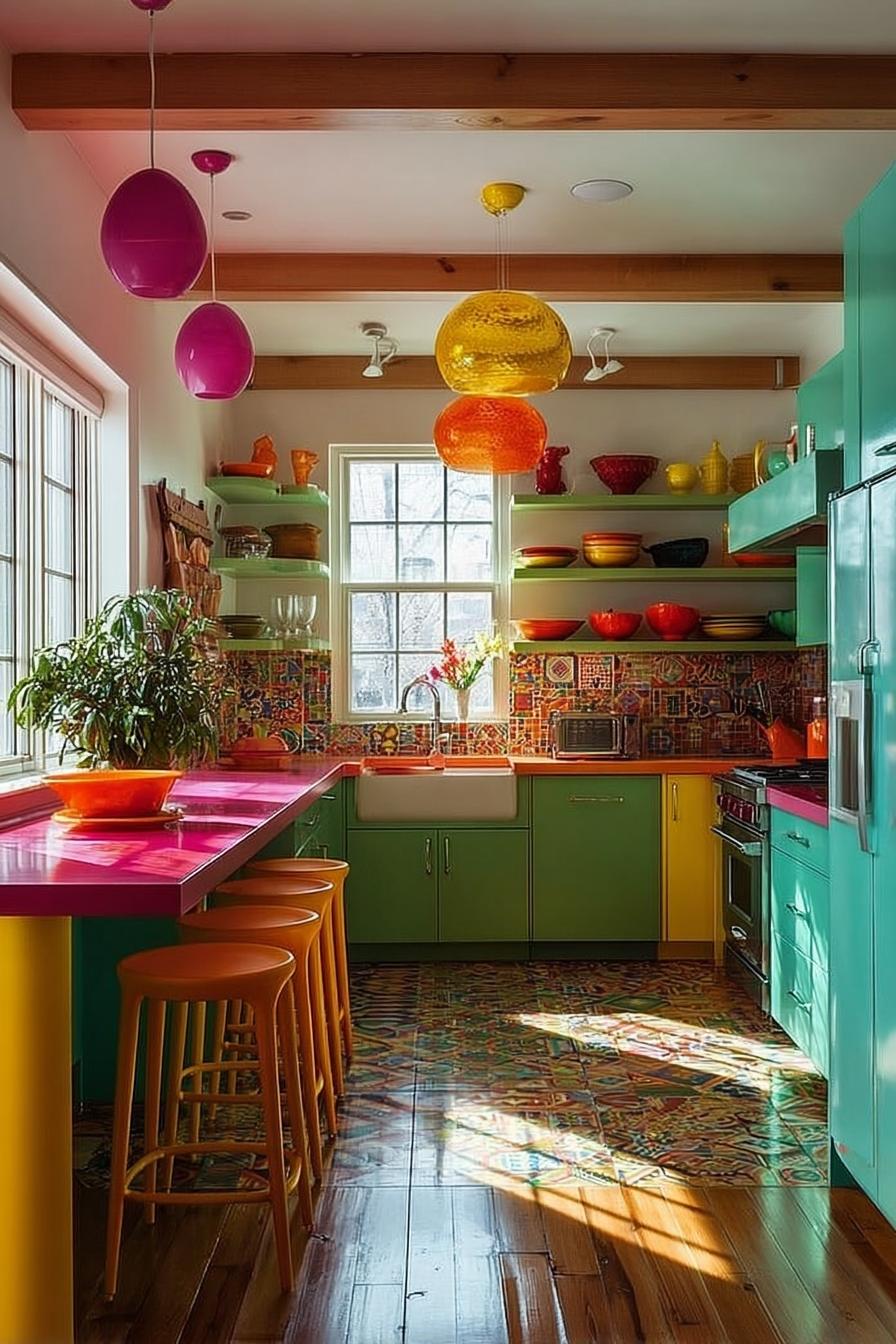
5. Hang Pendant Lights in Bold Colors For a Modern Look
Unlike recessed lighting that disappears into the ceiling, colorful pendants announce themselves. They’re the jewelry of your kitchen – statement pieces that catch eyes and start conversations.
Consider a trio of cobalt blue pendants over your island. When switched off, they’re sculptural elements adding depth to your color palette. When illuminated, they cast tinted shadows that warm the entire space.
A friend recently installed oversized emerald green globes in her white kitchen – the effect feels like dining in a chic restaurant rather than a suburban home.
The ripple effect surprises people. Bold pendant colors influence your other design choices – suddenly you’re selecting dish towels that echo that cobalt, or adding artwork with similar tones. One lighting decision reshapes your entire color approach.
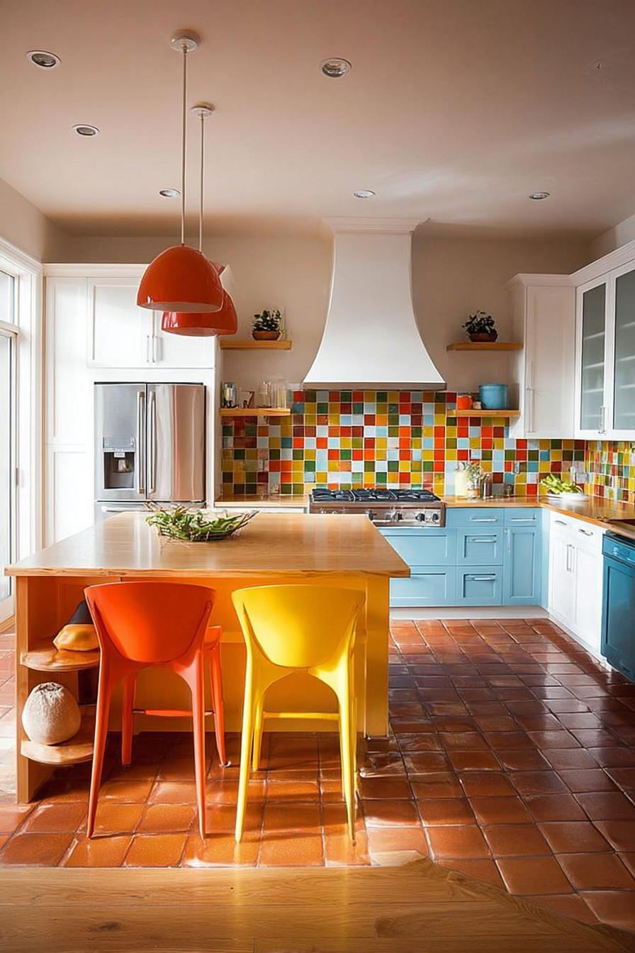
6. Highlight Bold Contrasts with Red Chairs For Cool Impact
Red kitchen chairs against white walls? It sounds jarring until you see it executed well – then it feels genius.
The psychological impact hits immediately. Red energizes, stimulates appetite, and creates warmth. In a kitchen – a space already associated with nourishment and gathering – red seating amplifies these feelings. Your morning coffee feels more invigorating; dinner parties become more animated.
The chairs become conversation catalysts, drawing people in rather than letting them hover by the doorway.
The trick lies in repetition. Echo that red in small doses throughout: a few tomatoes in a bowl, a vintage poster with red accents, perhaps a single red cookbook spine on display. These subtle callbacks prevent the chairs from feeling disconnected, creating visual rhythm across the space.
Moving forward, expect to see more homeowners embracing single-color statement furniture. The all-neutral kitchen had its moment, but personality-driven spaces are claiming the spotlight.
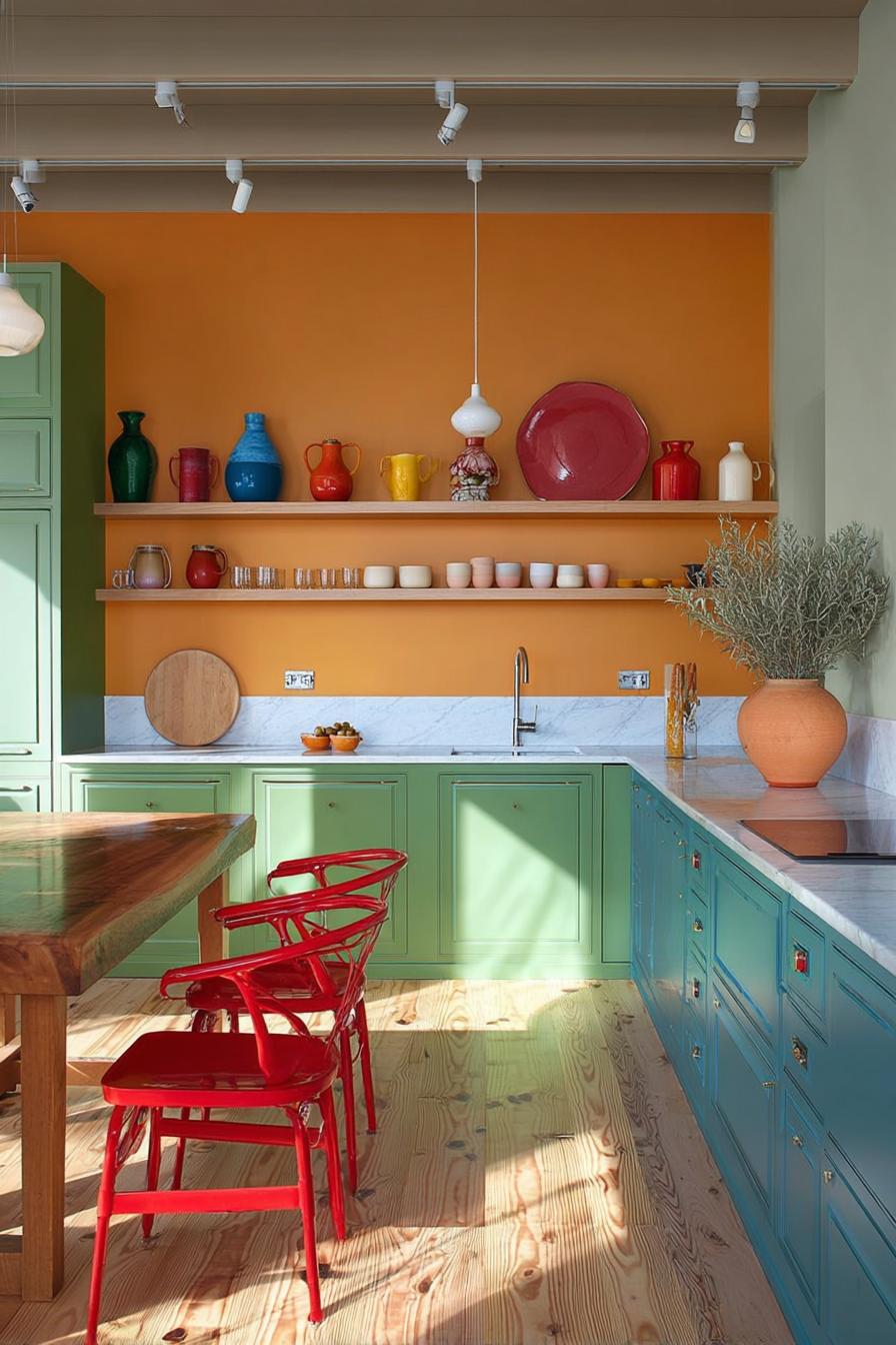
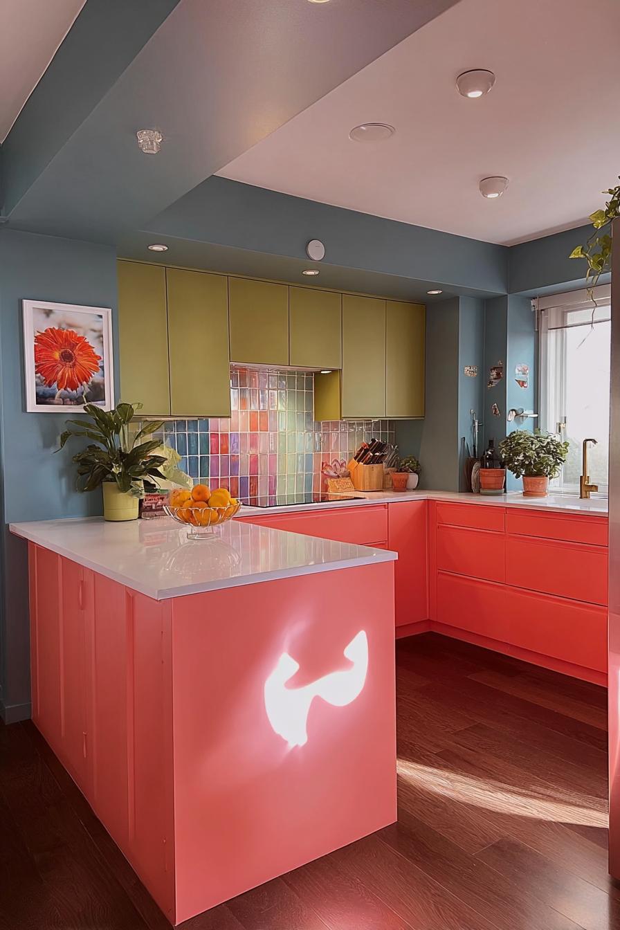
7. Paint Lower Cabinets Green For Fresh Colorful Energy
Green cabinets are like bringing the garden inside – they ground your kitchen with natural energy while keeping things sophisticated.
Start with the shade selection. Forest green reads formal and traditional, especially with brass hardware. Sage whispers rather than shouts, perfect for those testing color waters. But olive – olive strikes the sweet spot between bold and livable. Picture olive lower cabinets beneath a white subway tile backsplash, topped with butcher block counters.
The combination feels both fresh and timeless, like something you’d find in a Tuscan farmhouse or a Brooklyn brownstone.
The psychological effects run deeper than aesthetics. Green reduces stress, promotes focus, and creates a sense of balance. After long workdays, you’ll find yourself gravitating toward this space, not just for food but for restoration.
This two-tone approach – colored lowers, white uppers – serves as a gateway to bolder choices. Once you live with green for a few months, that navy blue or terracotta you’ve been eyeing might not seem so scary anymore. For those looking for a more dramatic transformation, consider black kitchen designs that make a striking contemporary statement.
8. Arrange Open Shelving with Colorful Dishes For Small Spaces
You know that collection of mismatched plates hiding in your cabinets? Time to make them the stars of your tiny kitchen.
Open shelving forces you to curate, and in small spaces, every item becomes decor. Stack coral dinner plates next to teal bowls, arrange rainbow-hued mugs by gradient – suddenly your everyday dishes create an art installation. The visual weight of color draws eyes upward, making low ceilings feel higher.
Plus, you’ll actually use these pieces more when they’re visible and accessible, rather than buried behind cabinet doors.
9. Combine Blue Lower Cabinets with Terracotta Tile Flooring
Who decided kitchen floors should be neutral anyway?
This Mediterranean-inspired combination brings unexpected warmth to modern kitchens. The cool blue cabinets – imagine them in a dusty navy or deep cerulean – create visual weight at ground level, while terracotta’s orange undertones add earthiness. Together, they achieve balance: neither too cold nor overwhelmingly warm. The bonus?
Terracotta ages beautifully, developing patina over time, while blue cabinets hide scuffs better than white ever could.
Take the plunge – your feet (and eyes) will thank you every morning when that terracotta glows in the sunrise.
10. Layer Multicolored Tiles For Instant Visual Interest
Notice how most kitchens treat backsplashes as afterthoughts – white subway tile, maybe a subtle pattern if they’re feeling adventurous.
Multicolored tiles flip this script entirely. Imagine a patchwork of blues, greens, and golds creating a tapestry behind your stove. Each tile tells its own story while contributing to the larger narrative.
In one kitchen I visited, the owner used leftover tiles from various projects – a sustainable approach that created the most stunning, unrepeatable mosaic. The randomness felt intentional, like a carefully orchestrated chaos.
But here’s what nobody mentions: busy patterns show splashes and stains less than solid colors. That gorgeous artistic backsplash? It’s also practical – though clean it regularly anyway, as grout lines can darken over time.
11. Mix Muted Yellow Upper Cabinets with Neutral Countertops
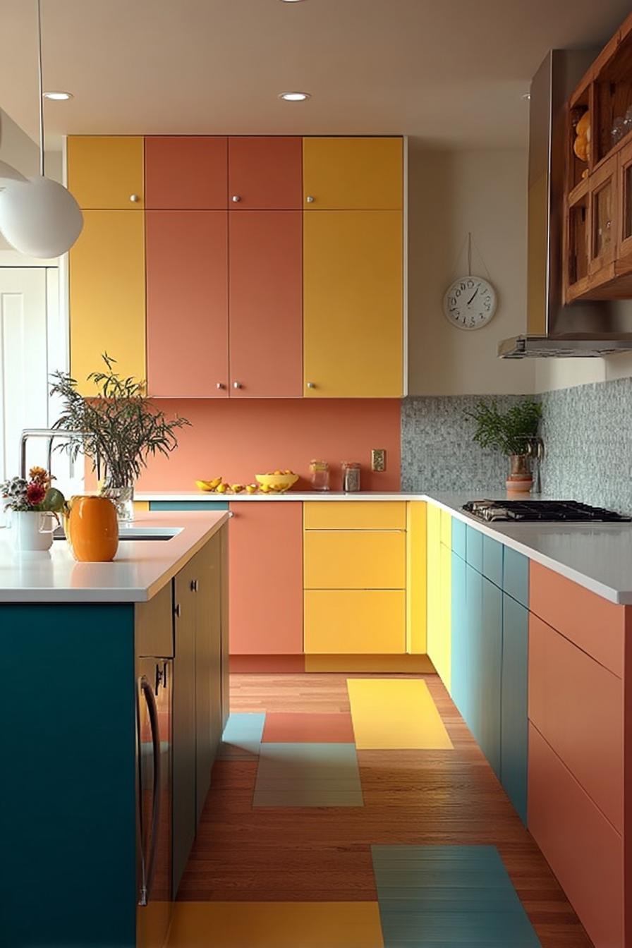
Yellow in kitchens often gets dismissed as “too much” – probably because people imagine screaming neon rather than sophisticated butterscotch.
Muted yellows – think mustard, ochre, or buttermilk – bring subtle sunshine without overwhelming. These shades work particularly well on upper cabinets where they catch natural light throughout the day.
Pair them with concrete or light gray quartz countertops, and suddenly you’ve created a Scandinavian-meets-California vibe that feels both cozy and contemporary. The neutrals ground the yellow, preventing it from dominating while still letting it shine.
The result? A kitchen that actually makes you happier. Studies show yellow stimulates serotonin production – meaning your morning routine literally starts on a brighter note.
12. Swap Standard Kitchen Chairs For Vibrant Mismatched Seating
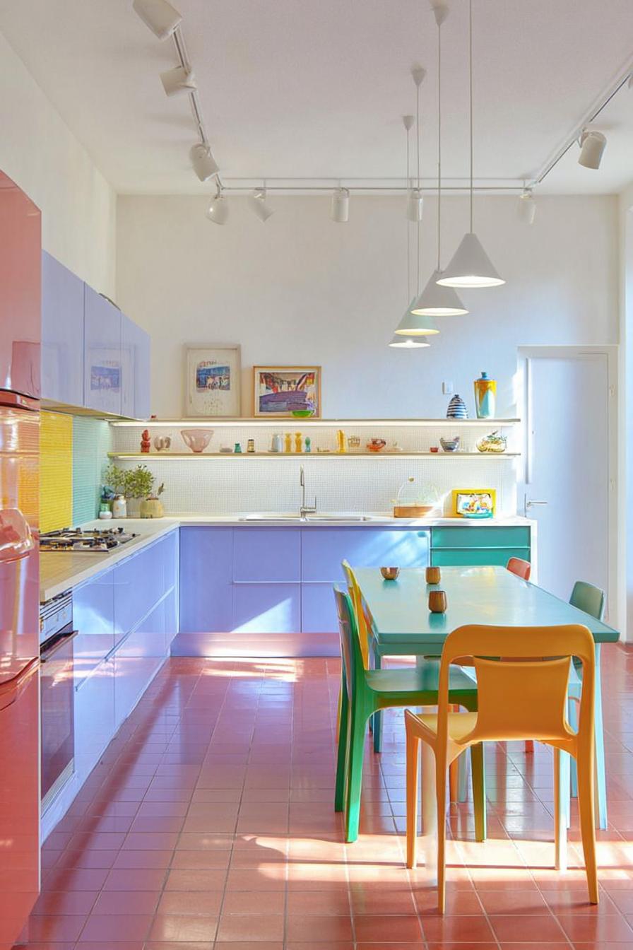
Matching chair sets feel safe but forgettable – and if you’re eating three meals a day in the same spot, why settle for boring?
Collect chairs in different colors but similar styles: a turquoise Eames replica, a coral metal café chair, a yellow wooden Windsor. The key lies in finding a common thread – similar heights, complementary materials, or unified era.
This curated chaos adds personality while solving a practical problem: when one chair breaks, you don’t need to replace an entire set. Each piece tells its own story, collected from flea markets, online finds, or inherited from family.
13. Balance Bold Cabinetry with Subtle Grey Patterned Wallpaper
Forget what you’ve heard about wallpaper in kitchens being impractical – modern versions handle humidity and splashes beautifully.
Grey patterned wallpaper serves as the perfect backdrop for colorful cabinets. It adds visual texture without competing for attention. Think delicate geometric patterns or subtle botanical prints in various grey tones. Against emerald green cabinets, this creates depth without chaos.
The pattern prevents the space from feeling flat while the grey keeps things grounded – essential when you’re working with statement cabinet colors.
Quick tip: Apply wallpaper to just one accent wall, perhaps behind open shelving, for maximum impact with minimal commitment.
14. Break Up Cabinet Fronts with Playful Color Blocking
Often overlooked: your cabinet doors don’t need to match.
Paint alternate doors in complementary colors – navy and coral, sage and blush, or yellow and gray. This approach works especially well on upper cabinets where the color blocking creates visual rhythm at eye level.
One designer friend painted her cabinets in gradient shades of blue, from pale sky to deep ocean, creating an ombré effect that guests always notice.
Styling a kitchen island with color-blocked cabinet doors can create a stunning focal point that ties your entire design scheme together.
15. Spotlight Vibrant Fruit Bowls For a Fresh Color Pop
The current obsession with minimalism sometimes forgets that kitchens should feel alive – and nothing says life quite like a bowl overflowing with lemons or persimmons.
Large ceramic bowls in electric blue or sunshine yellow don’t just hold fruit; they frame it. Those ordinary apples become part of your color scheme. Seasonal changes bring new palettes – citrus in winter, stone fruits in summer, gourds in fall. The bowl itself becomes a permanent fixture while its contents provide ever-changing color stories.
It seems almost too simple, but this single addition can shift your entire kitchen’s energy from sterile to welcoming.
16. Transform Walls with Oversized Floral Murals For Dramatic Color
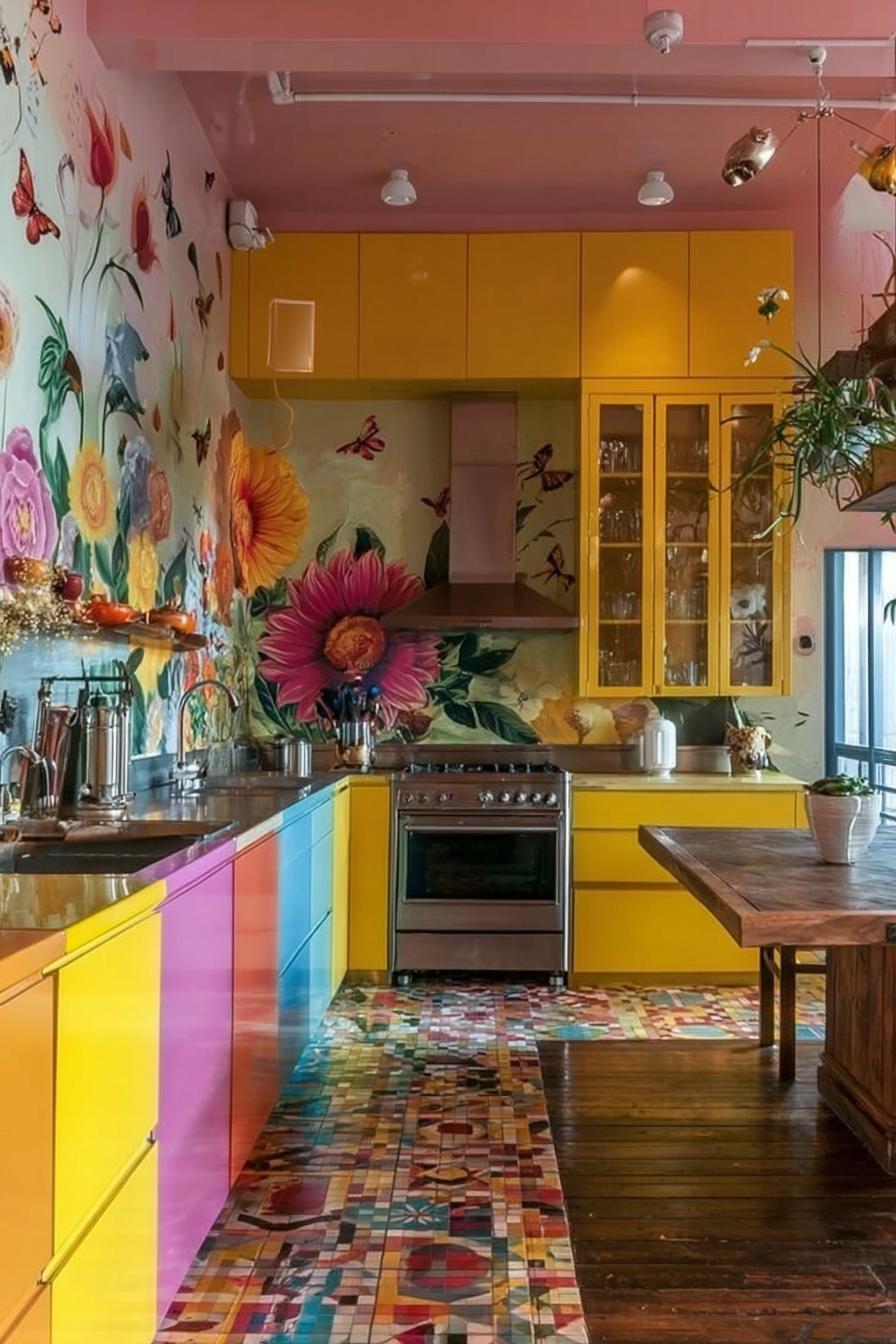
Did you know that botanical wallpapers were originally hand-painted by artists who spent months on a single room?
Today’s murals offer that same dramatic impact without the Renaissance-era timeline. Oversized florals – think peonies the size of dinner plates or tropical leaves that reach from floor to ceiling – create an immersive environment. Install one on your dining nook wall, and suddenly every meal feels like a garden party.
The scale matters here; small patterns read as busy, but enormous florals feel artistic and intentional. They become the room’s focal point, allowing you to keep cabinets and counters simple.
This maximalist approach might seem bold now, but design forecasters predict we’ll see more statement walls as people crave personality over perfection in their homes.
Conclusion
Your kitchen doesn’t need to whisper in neutral tones when it could sing in full color. Start small if you’re hesitant – add those colorful bowls or swap in one vibrant chair. Once you experience how color transforms your daily cooking routine, you’ll wonder why you waited.
The kitchen you imagine is completely achievable; all it takes is choosing that first splash of color and building from there.
“`